LOGO FOCUS
Your logo is often the first thing prospective clients notice about your business, whether they spot it on the high street or on Instagram – which is why it’s crucial that yours makes an impact
We chatted to a range of salons to find out what they think makes a great logo and how they created theirs.
Richard Phillipart, owner of The Boutique Atelier:
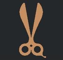
“I wanted our logo to reflect the brand ethos, with a recognisable hairdressing element. The placement of the scissors incorporated into the letter Q was our designer’s idea – and we have also been able to use the same scissor design in the smaller version of our logo, which fits perfectly into the profile picture space on social media. Our logo was the product of a collaboration between myself and a graphic designer, who I found by putting a call out on the salon’s social media.”
Kaye Sotomi, founder and CEO, Chop Chop London:
“Everything about the Chop Chop name and logo was carefully thought out. The name has a dual meaning: because we are known for our speedy and accessible haircuts. In fact, when we first opened in 2018, all of our services were delivered within 30-40 minutes, at Chop Chop speed. We wanted both the name and logo to be simple yet detailed, memorable but not confined to hair only – meaning we can create cool merch, products or even open a production company if we wanted, using the same name. We decided to use no more than two words and keep each word no longer than six characters, as data shows brand names that are within this character count are a lot more memorable – think Nike, Apple, Coca-Cola, Google and Amazon. When it came to the colour, green was a no-brainer, as we pride ourselves on being a sustainable business. This specific shade of dark green was selected because it is a luxury green. As a company, we believe luxury is not dictated by pricing but by authenticity.”

Aron Calder, Director, House of Hare:
“We rebranded the salon name a few years ago and needed to create a new logo at the same time.
Therefore, the journey of creating the logo came hand in hand with the new salon name. We started with a visual board on a WhatsApp group, lots of different images representing the Cotswolds (Lavender, wildflowers, traditional Cotswolds stone buildings, wild animals like foxes and hares) and eventually we chose a ‘Hare’ image. There were four reasons we chose this.
Firstly, the name of the salon was also renamed at the same time to “House of Hare Cotswolds” and we wanted to use a play on words with “Hair” and “Hare” in the name but also same concept with the logo which we did by incorporating a pair of scissors into the ears giving a big nod to hairdressing which is what we do.
We try very hard to put client comfort and experience at the heart of everything we do in the salon, and many times clients have given feedback saying they feel like they’re being welcomed into our 'home'. Therefore, we wanted to consider the name having something that represented a “home” for all.
We see hairdressing as part of the fashion industry as well as beauty, so we wanted to incorporate a fashion type feel to the name where 'House' was sometimes used in the fashion industry hence we came to our final name “House of Hare Cotswolds”.